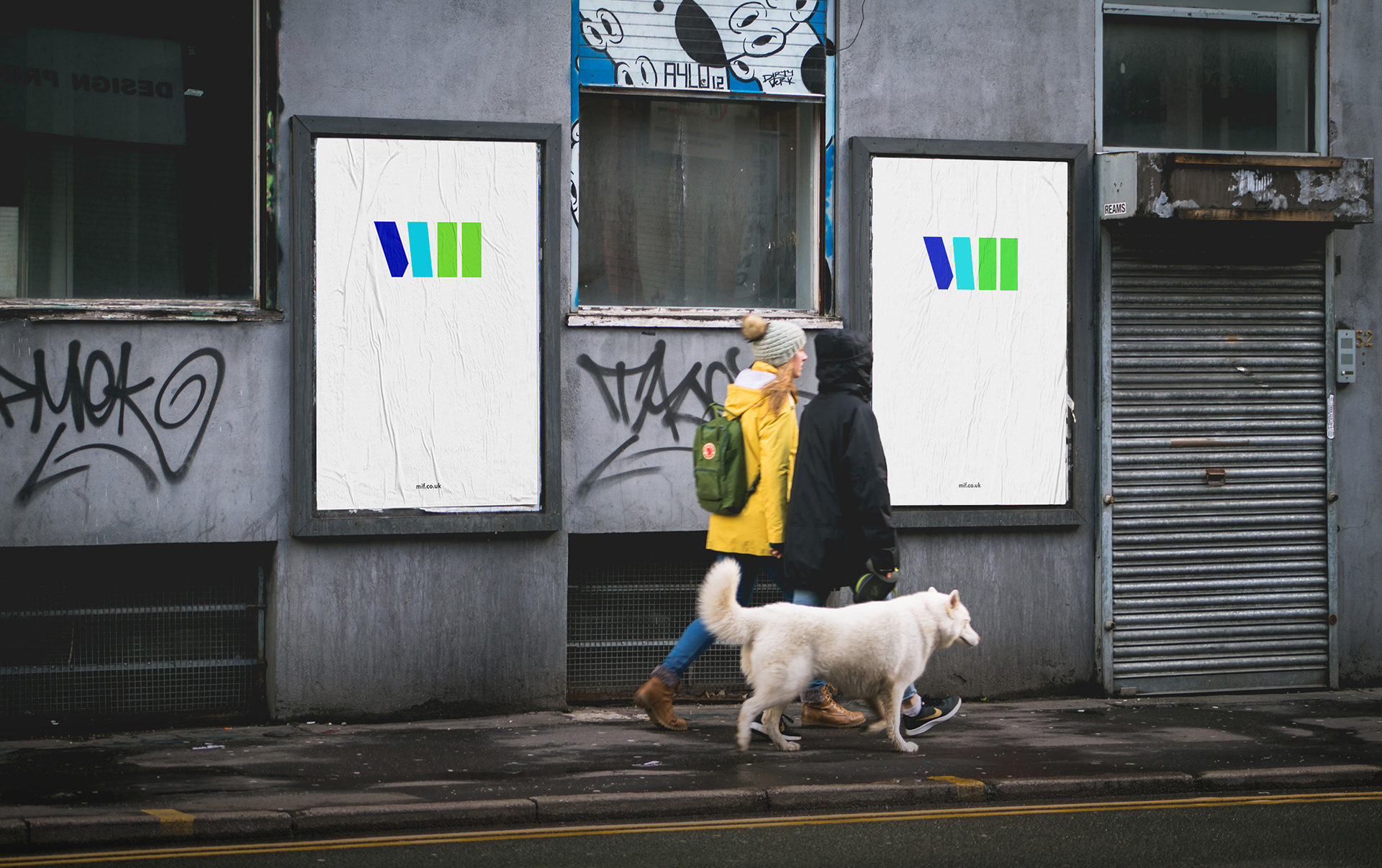
Visual identity for MIF17
Manchester International Festival (MIF) is a biennial artist-led festival focusing on original new work.
In 2016 I was invited to collaborate with Peter Saville, MIF’s Artistic Advisor, to refresh the festivals' visual identity for MIF17.
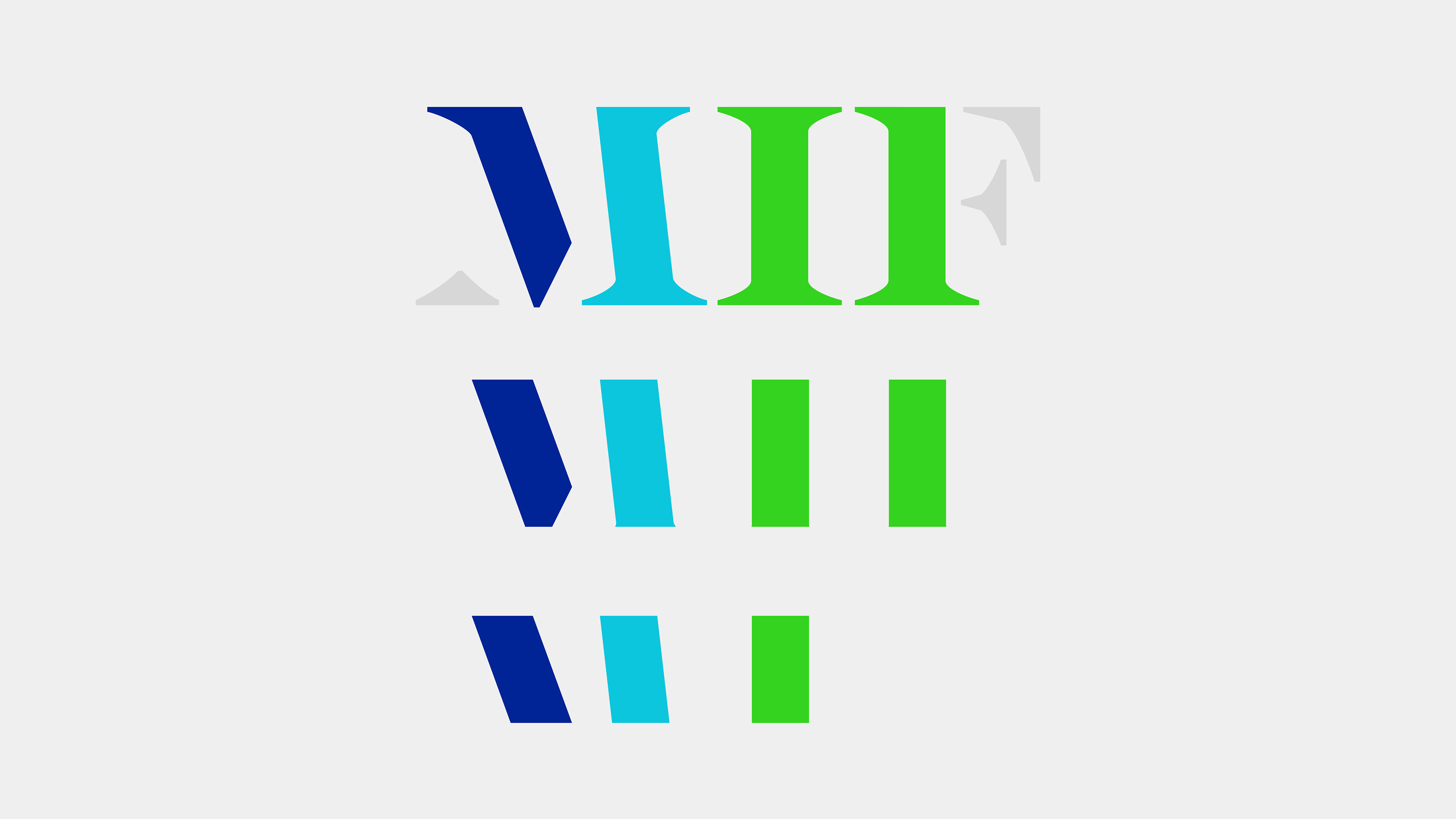
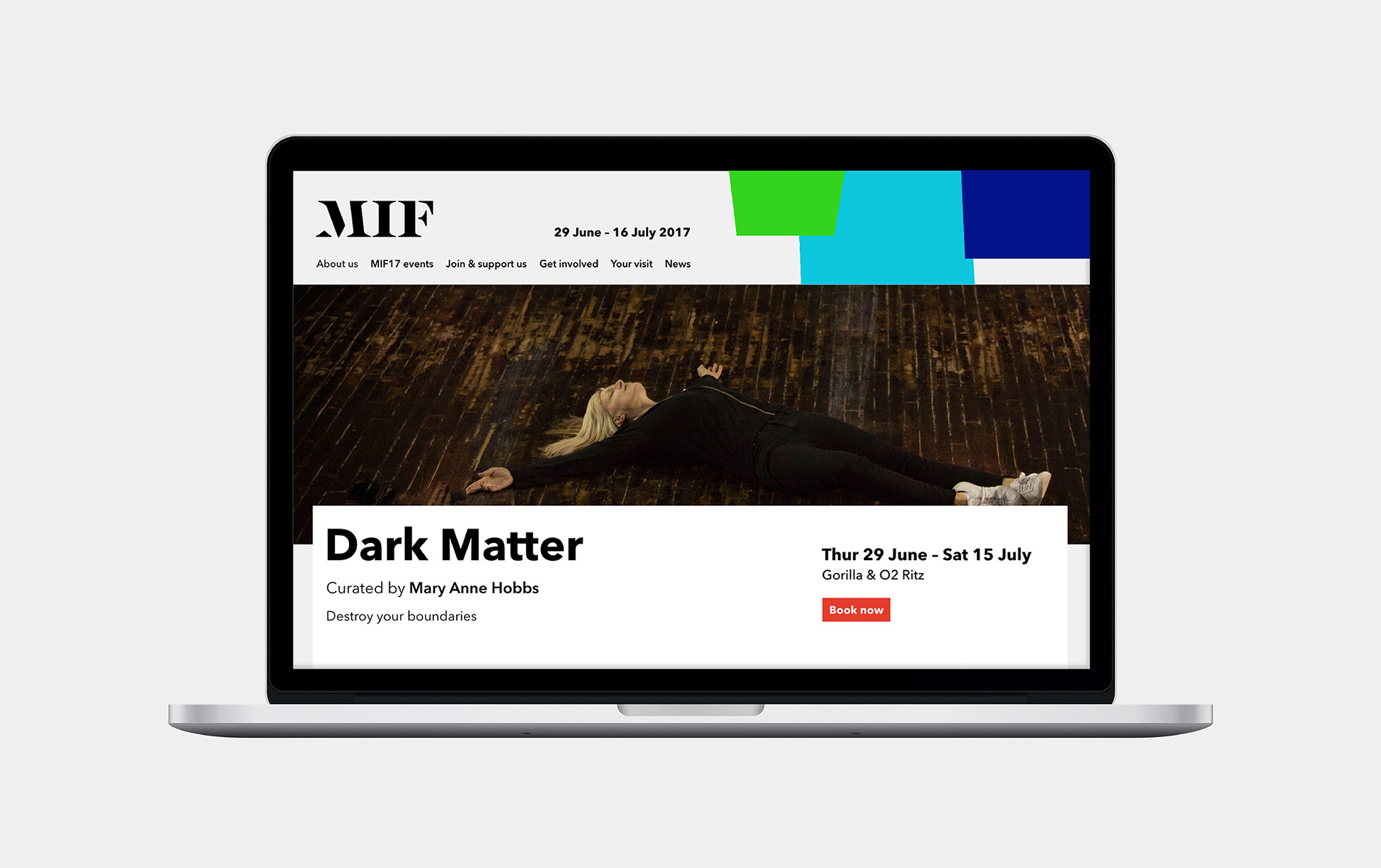
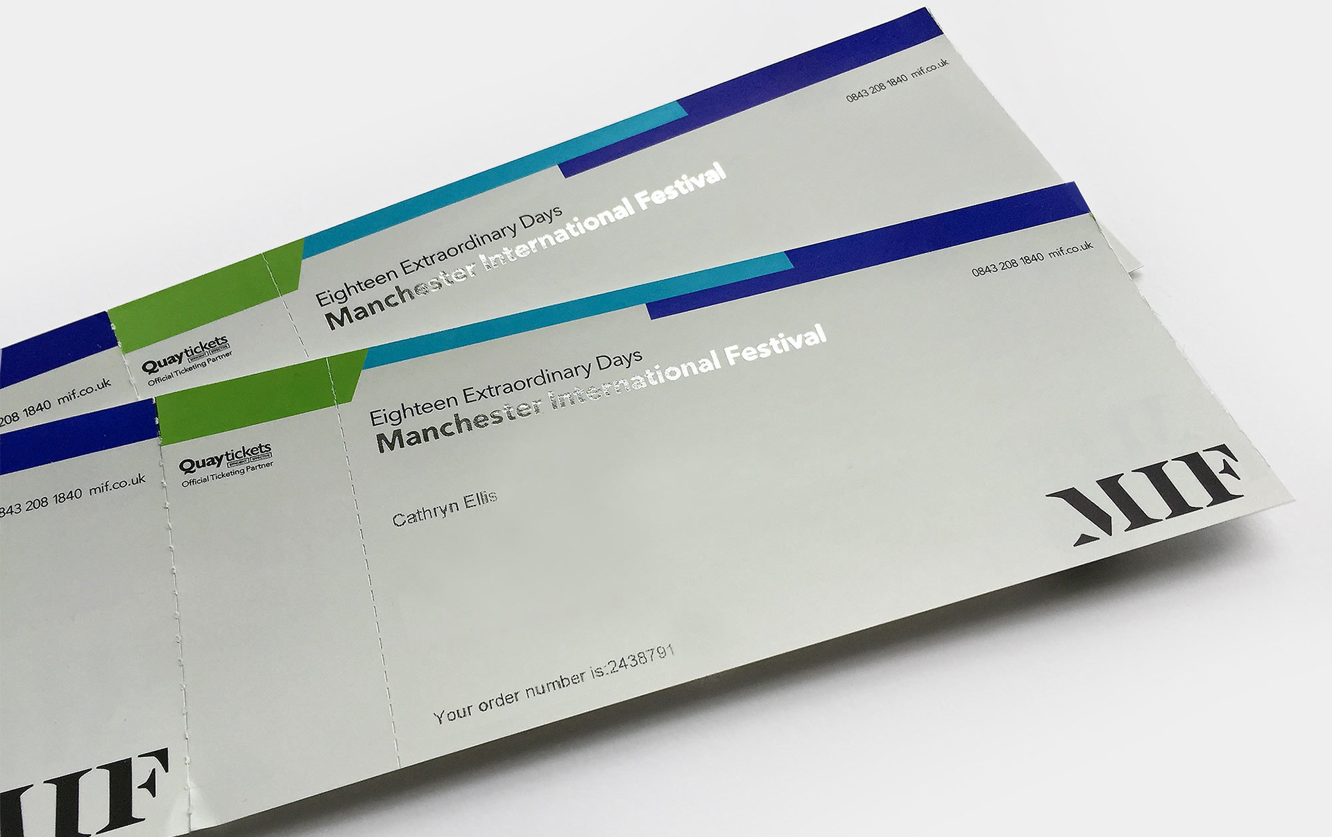
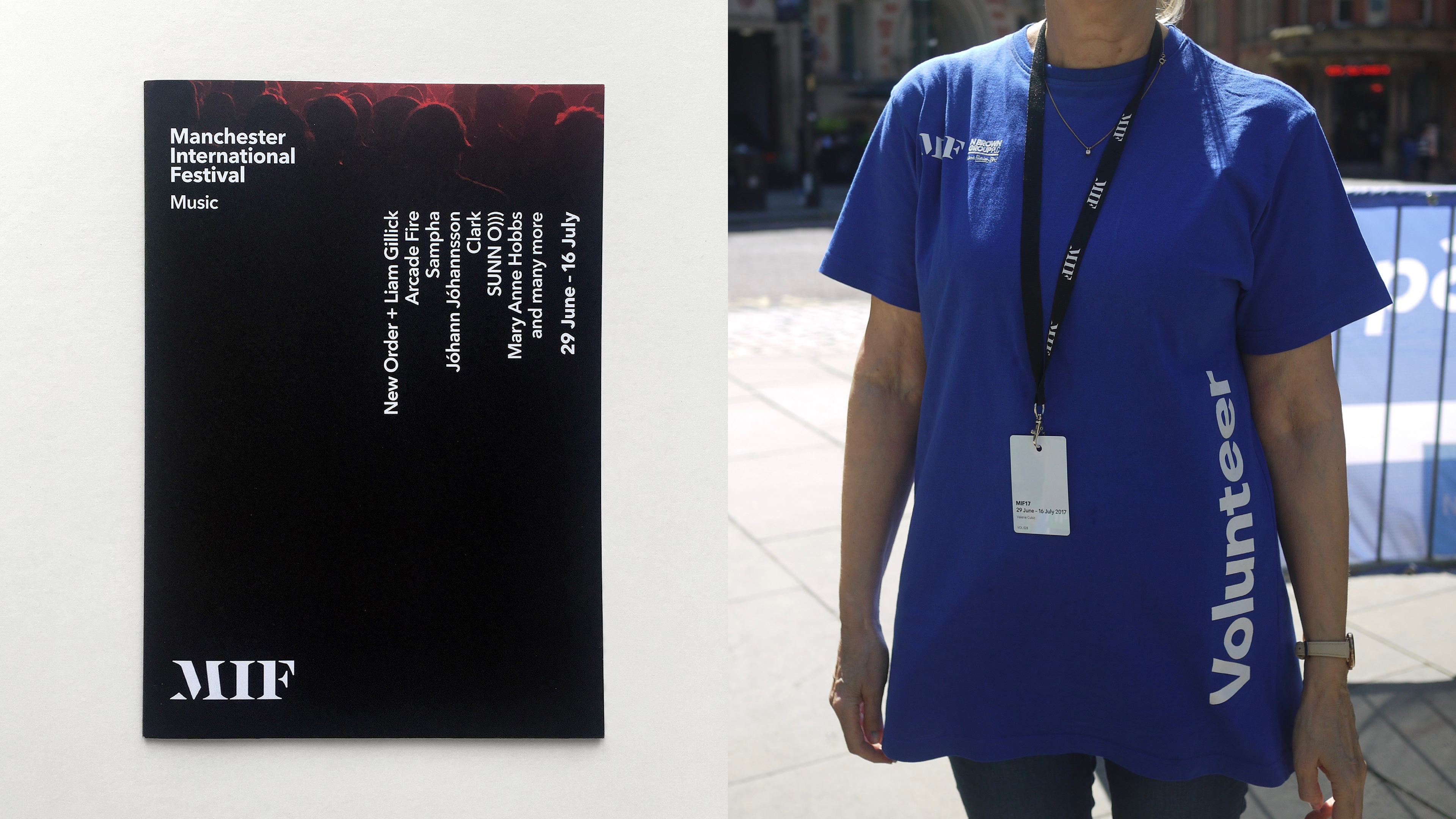
The identity brings together an evolution of the MIF logotype, crafted by Peter Saville and Paul Barnes, combined with my systematic approach to typography and a suite of reportage imagery by Donald Christie.
Working in-house on the 2015 festival gave me the valuable insight to evolve the identity in response to a rigid brief. I introduced a new typeface, colour palette, grid, logo positioning and print formats (reducing print costs as well). Plus, a simple yet significant change, converting sponsorship logos to mono to create a strong cohesive body of work.
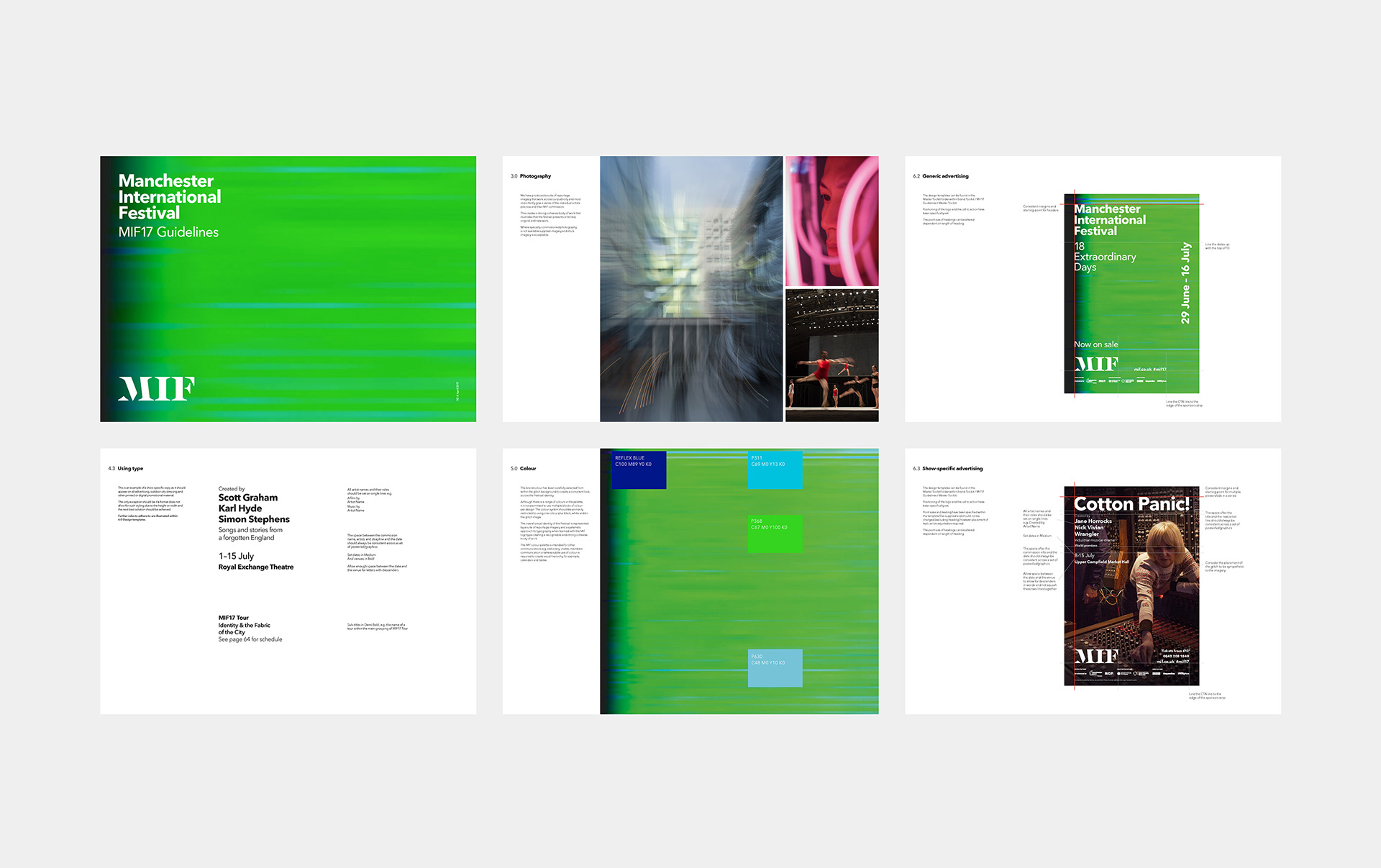
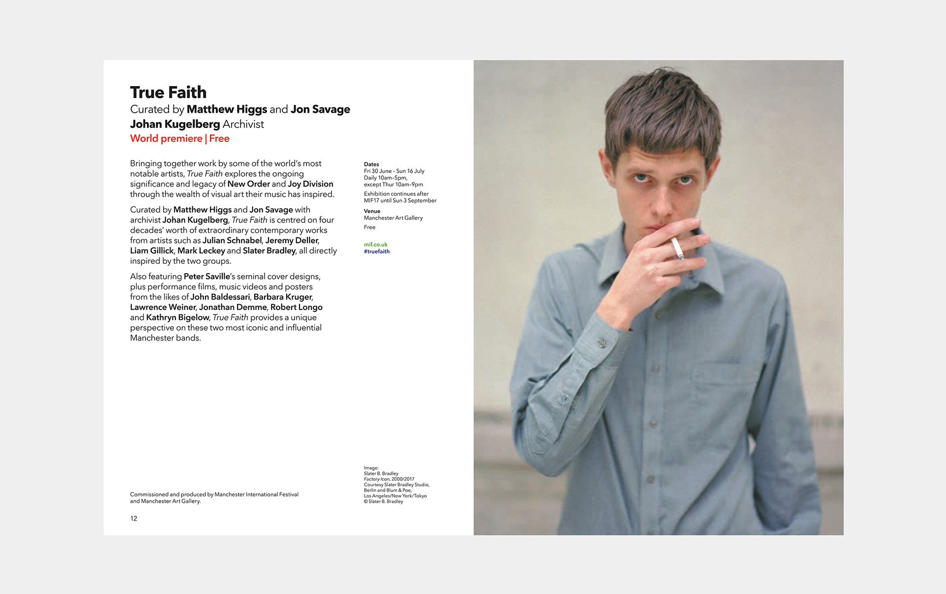
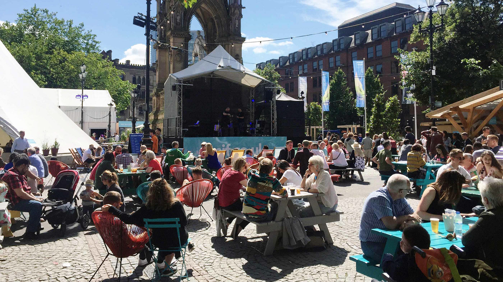
The project included development of design guidelines, providing direction to the in-house design team, concept for the main festival brochure, theatre programmes, advertising, web design, digital advertising and site-specific campaign collateral.